Accessibility Considerations

When designing content on a page, we often rely on what we can see to make things look readable and pretty. However, just adding bold or different size fonts doesn’t help users who rely on screen reader software or other add-ons to access information.
Use these ideas to add more functionality to your documents and web page design to make sure everyone can access the important information you have posted:
Header levels/Styles
Using header levels and header formats (sometimes referred to as styles) helps all users understand the flow of information on a page in much more detail. The really nice thing is that most web and/or document design tools provide a way to make those levels quickly and easily. |
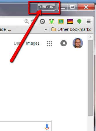
| Text Styles in Google Docs and Word |
If you use header levels to separate sections and content in your document, navigation becomes easy and clear to all users. Plus, there is a simple hierarchy to follow when using this to create a structure. Just be sure to follow it from top to bottom. It is confusing to screen readers and ultimately to our readers when a level is skipped or not in order.
Order for styles - We can use the “Normal text” option in between these as the content in each section. These are just the major dividers.
Title
Subtitle
Heading 1 (sometimes denoted by h1)
Heading 2 (sometimes denoted by h2)
Heading 3 (sometimes denoted by h3)
and on
See this Help Page from Google about creating and adjusting heading styles. Remember, our intent is to make sure that anyone can access and understand the information on our sites.
Lists
This one is pretty simple. If we can break up big chunks of text that have embedded lists with a basic bulleted or numbered list, we should. It’s easier to find the important information if it is laid out visually rather than in a long sentence.Alt text for images
This one applies only to images that serve a purpose on our documents and pages. The alt (or alternative) text is what will appear when someone scrolls over an image and a screen reader will read that to a user. It is best to include as much information as possible so that if a user cannot see the image, they get the idea of what the image would show.
If there is no real purpose, other than decoration, for an image, this should be filled with “” (empty double quotation marks) to help guide the screen reader to ignore the image. *Just be cautious of making too many images empty because that means there are too many images that don’t serve a purpose and could cloud the message you are trying to convey in the first place.
Tables
Web pages used to be built on a structure of tables, but in more recent years that standard has been replaced with much better ways to style a page (CSS and HTML5 standards). So, only use a table when you want to display a table of data or information, not to structure content on the page.More Information
For more information about making your Google Docs, Word Docs, or PDFs accessible, check out these websites:
- Make your Google document accessible
- WebAIM - Make your PDF accessible - tips on how to convert Word documents into accessible PDFs
- Format Accessible Documents - A guide from Blackboard (my district's website provider)
For information about accessibility on Schoolwires/Blackboard, visit their accessibility help site.


Comments
Post a Comment